Website Revamp
The website has managed to expand its reach and is now attracting visitors not only from the local area, but also from nearby towns, resulting in a significant increase in revenue.
A website redesign that needed upscale feel after the business updated their store and wanted a new fresh look to reflect their new redesigned store.

My Role
Researcher
UX Designer
UI Designer
Collaborator

The Team
UX Designer
Developer

Tools Used
Adobe Xd
Photoshop
Illustrator

My Key Contributions
Project Management
Concept Ideation
Prototyping
Competitive Research
User Research
Layout Design
Existing Site
The site needed a facelift to increase more traffic and revenue.
challenge
Revamping the Website: Improving Visual Appeal and Reach
The old website had challenges, like low-quality images and a dull logo. To showcase the baked goods' beauty, we must fix these issues. We'll remove the excessive white background and add vibrant colors to make it more enticing. The logo will also be updated to be simple yet eye-catching. Our goal is to attract both local and nearby customers by expanding the website's reach. With these improvements, the site will become a virtual gateway to a delightful culinary experience, appealing to visitors from local and beyond.
solution

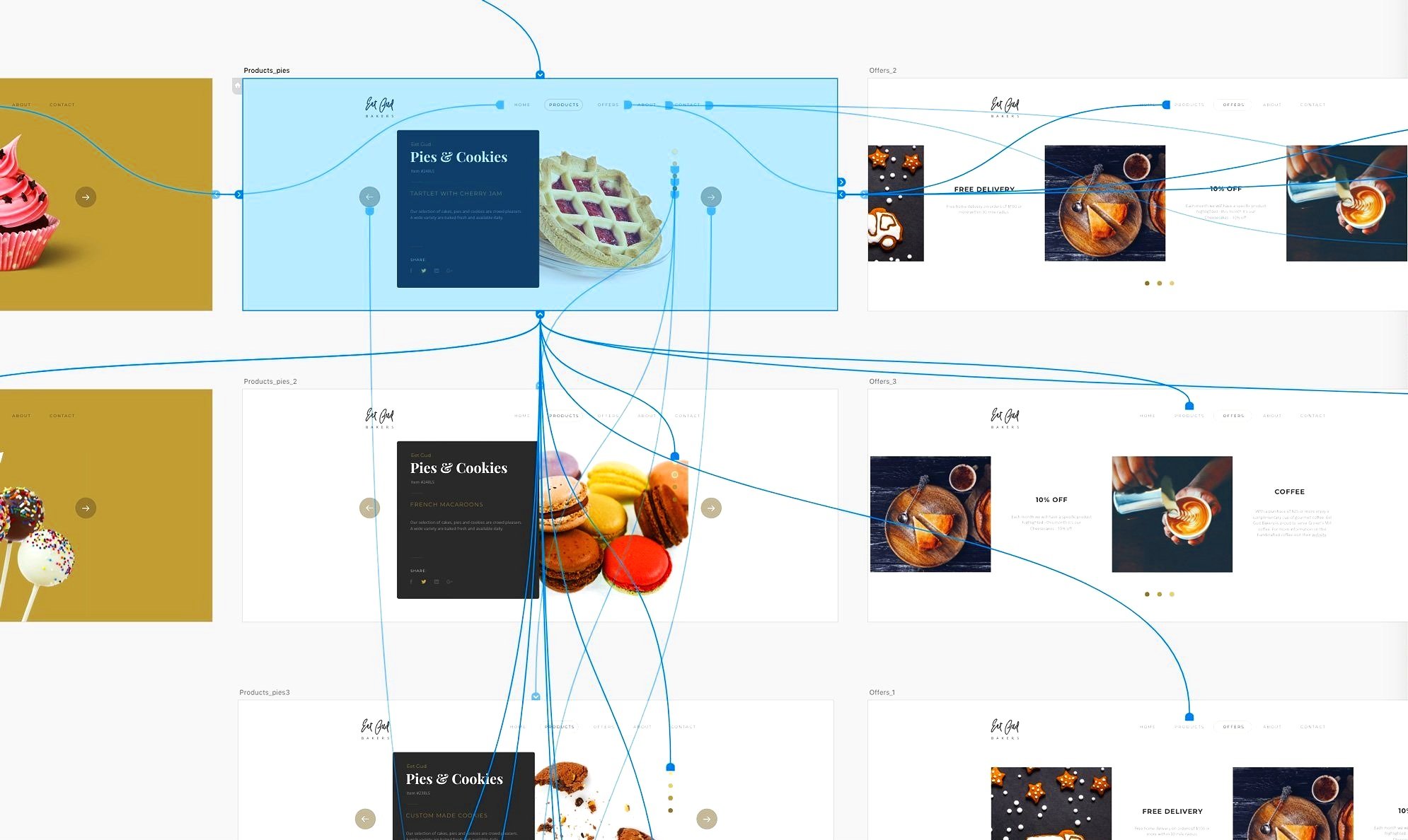
To entice users to visit the bakery, the store front begins with a color palette based on flour and gold, with added icing colors that pop. A high-quality food photographer’s services were used to showcase a single image on the homepage with clickable arrows that lead to reviews from Google. Typography plays a major part in our design, emphasizing our 90-year tradition of providing the same high-quality products that keep customers coming back to Eet Gud! To achieve a less cluttered look, we combined some pages, such as "About Us" and "Our Bakery," and removed hard square corners to baguette-shaped buttons.
As a UX designer, I took the initiative to create initial sketches for the website layout. I drew the sketches after conducting extensive competitive research. I intended to present them to the owner and developer, showcasing my vision for the user interface.


Continued Process …
The new website is a big improvement over the original. It has a cleaner look and is easier to use. The new site has nicer pictures and easier navigation, which will encourage people to spend more time on it. This should lead to more people visiting the bakery and placing orders before they come. The owner is now considering adding options to order through the website. The site is still being worked on.


