Background
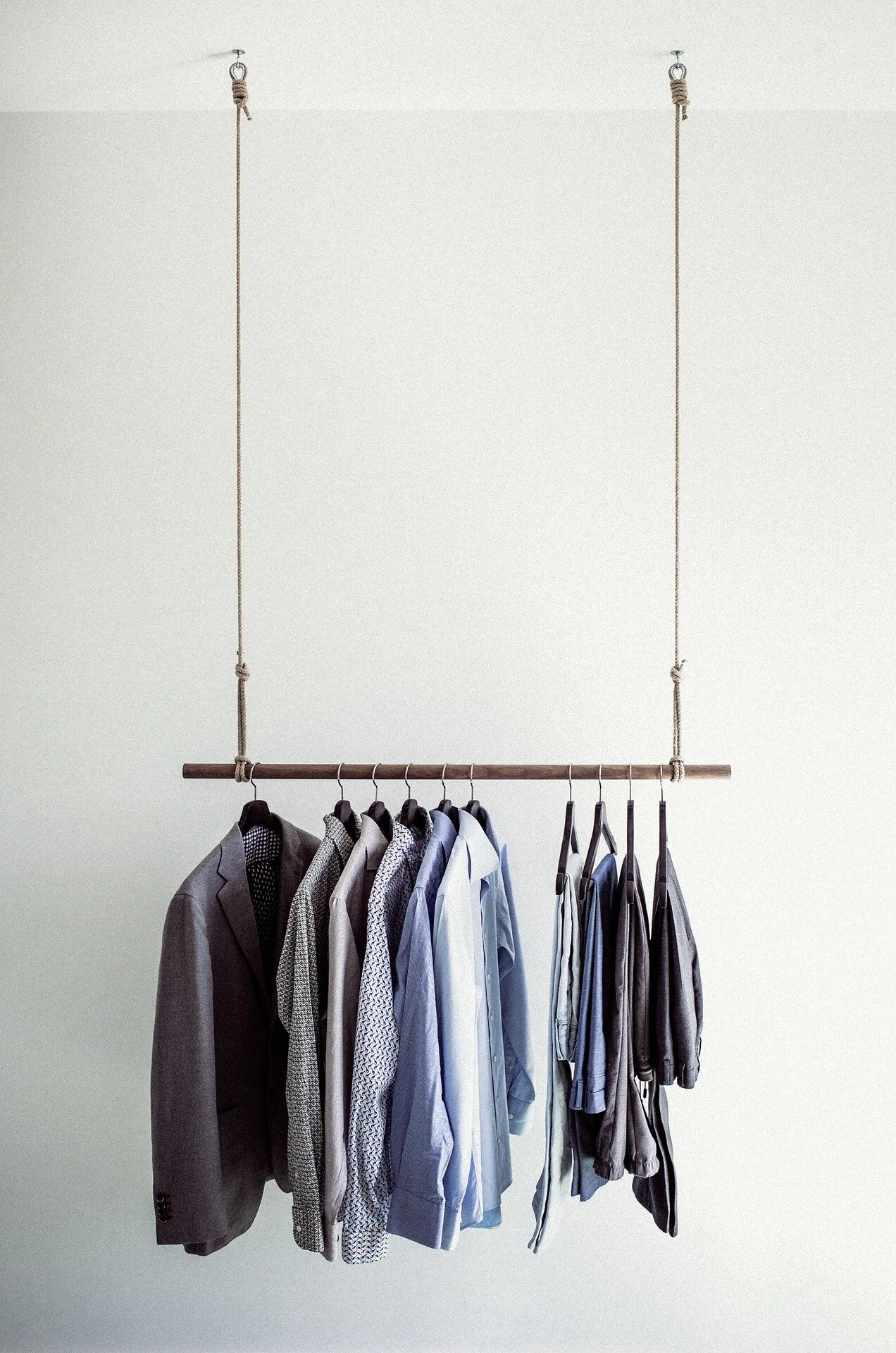
It’s hard to figure out what to wear when you have a closet full of clothes. You have many colors and hues that are so similar, you do not know which works with what until you unfold it and see and then decide the outfit for the day. Also, it’s hard to sort out clothes for each season. I’d like to explore how this can be an undaunting task that’s easy and fun.
I wanted to create an app that's easily accessible all the time for mobile users.
My target audience was busy people who either who wanted an extra hand to dress up in the morning or whenever they want to head out. This app would ease the process of selection and maybe organizing their closets as well.
The main challenge was how to easily select clothes based on personal preferences. For example how to choose clothes based on weather, color or a necktie.
My role as a UX Designer was to find out the pain points of users who face this problem as well as solving this with a usable interface that become their everyday arsenal.
Research
Primary Research
At the discovery phase of my project, I conducted primary research in order to get a better understanding of the problem. After doing the screener and filtering out the appropriate users (busy individuals who also use smart phones and are concerned with their attire), I interviewed them personally as well as remotely using Skype and FaceTime.
My research questions were based upon their experience with using similar apps. Also, what their main concerns were. Was it being fashion forward or being just a good dresser; did they need total help or just a little hand in making a decision; how they decide what to wear on a particular day? 46 people participated in the screener and 13 people were selected to be the part of the study.
After the interviews, I found out that people did not want help in finding what in fashion these days--they only wanted a quick way of selecting clothes from their existing wardrobe. Their main pain point was that no existing app was helping them select clothes to filter out based on their individual preferences of color and weather etc.
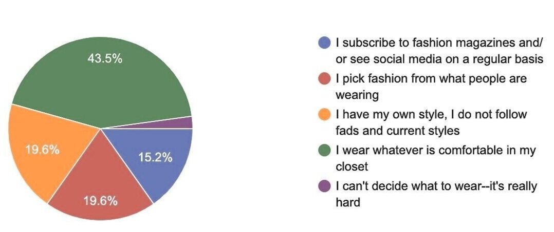
Pre-screener Results
46 people participated in the screener and 13 people were selected to be the part of the study.
“I do check instagram but most of the clothing of celebrities are out of my comfort zone ... i have my own style.”
Heuristics
As the first step of the research process, I evaluated some existing apps or websites using Nielsen Heuristic method, which tried to solve the similar issue.
I wanted to see if and how those websites solved the issue of getting dressed easily. Also, if they are easy to use as well.
A lot of apps that are fashion and clothes related, focus towards women primarily. I do not see a lots of sites helping single or married men who also face these issues of not knowing what to wear and how to organize their closets.
After reviewing the sites, I found out that while some of the apps were close to help users of getting dressed, they required a steep learning curve. Some had too many functionalities that would confuse users and would take away from the basic and most important function of the app.
Analysis
Affinity Mapping
After finding out what needs to be taken care of and what actually users are looking for, it was time to gather all feedback and ideas from the users and analyze it. This helped me come to come up with possible solutions that can solve the issues. This also helped me create personas
Personas
Taryn Smith
School Teacher. 41 years old, M.Ed., Single
Strong woman but suffer from arthritis.
Watches Tidying Up with Marie Kondo on Netflix.
A night relaxing in the bathtub is better than a night out.
Owns Alexa, automatic bread maker and iPhone X.
Motivations:
Doing Yoga and beautiful things in life.
Spending time with a group of selected friends who she can share her secrets with is the time well-spent.
Making the improvised version of the pasta from the restaurant she visited with her friends last week.
Needs:
Less hassle and more time to meditate.
Confident and a put-together look.
More time to spend with her friends.
“I know what suits me. I just need an extra hand.”
Sara Sanders
College Student. 23 years old, Fine Arts Major, Dating
Friendly, easy going, smiling.
Always busy with college projects.
Dresses casually most of the time.
Snap Chat is the way to go.
Motivations:
Beautiful spreads in a magazine.
High end boutique’s window displays.
Spending time with her boy friend.
Staying in touch with friends.
Needs more organization in her life and help in clothes’ selection.
Needs:
Wish if she can dress as good as others in her friendly circle does.
Needs more organization in her life.
Wants more help in clothes’ selection.
“Urgh... why doesn’t this look right?”
Solutions
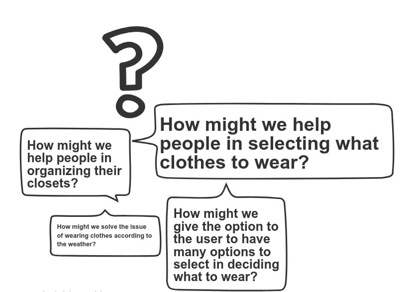
To articulate the problem, I asked how this problem might be solved. I asked different questions:
How might we help people in selecting what clothes to wear?
How might we help people in organizing their closets?
How might we solve the issue of wearing clothes according to the weather?
How might we give the option to the user to have many options to select in deciding what to wear?
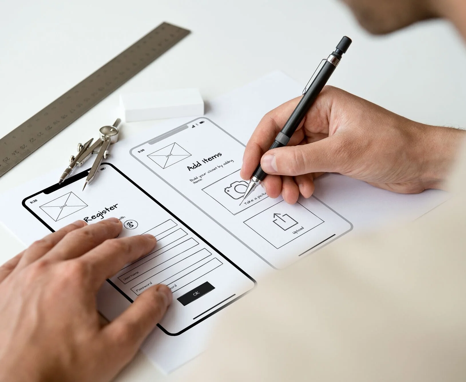
Sketches
After gathering ideas, researching, interviewing people and doing secondary research, I came up with some solutions that can help users and answer the How Might We questions. I usually start the design process with low fidelity sketches. This is the way I iterate through many design options quickly. I created two rounds of sketches. The first one was nothing more than the possible placements of the functional elements needed. The second was more refined and then prototyped in inVision to get feedback from the users.
Wireframes
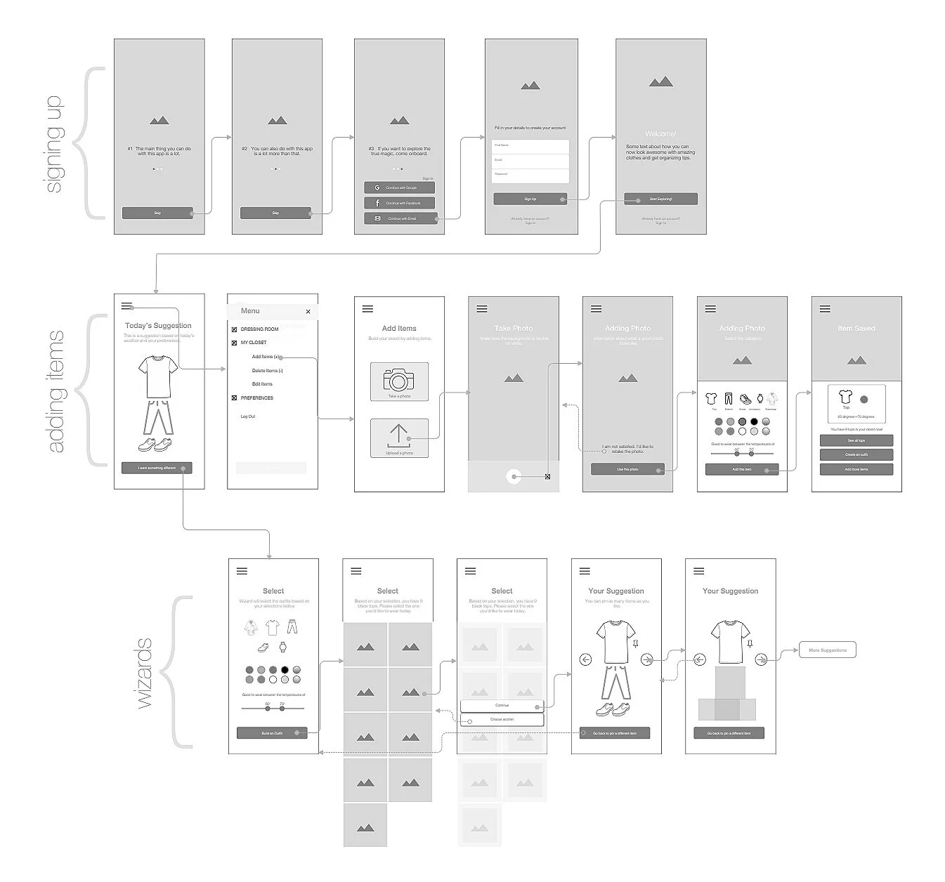
After sketches I created some refined versions as wireframes for testing purposes. Even though the wireframes were nowhere near the finished project, I introduced some structure to the layout and typography. SketchApp was used to create the wireframes.
Then again, it was time to get feedback from the users and I made some changes accordingly. For example users suggested a bigger clicking area for buttons and bolder text.
Wireflows
I also created wireflows to make sure the screens' flow is efficient and makes sense.
Final Stages
Mood board
Style Guide
After checking all the functionalities and basic processes, it was time to dress it up. In this stage, I created a mood board first to see how I want the app to look like and if it would appeal and fit to the personas I had created before. After creating the mood board, I created a style guide so it was easy to refer throughout the design process and a handy guide for the developing team.
Color Palette
All the colors are modern and neutral with an accent of wood color for suggesting closet.
Typography
Raleway font was clean, easy on the eye and looks great on the screen. I used different weights throughout the app.
Once I tested out all usability mistakes, I started designing the final screens in Sketch.
And then it was time to retest the high fidelity prototype.
I tested on the three red routes, which were the most important. They were on-boarding, adding items to the 'closet' and customizing a suggestion. My test subjects were people who had some fashion sense and knew how to use a smart phone. And since I was designing for iOS, I was making sure the users knew how to use the operating system. My test was moderated. I wanted to see how users react to the design and if they complete the given tasks easily. The tasks were to:
Sign up
Add an item to your closet
Create an outfit
Feedback
The feedback was very good as it did not bring any red flags. However some minor issues/comments were:
I might suggest making the text on buttons a bit more bold as they don't seem to stand out greatly from the background.
On the details page maybe think about removing one of the “YOUR” words in the prompt message. Example - “Fill in details to create your account” or “Fill in your details to create an account.
“I am totally going to use this app.”
What I have learned from this project?
People do not just look for a ‘pretty’ app. It has to go through a tight screening and feedback from the actual users. I learnt that:
Even if a thin font looks modern, it might not be best to use it if there are visibility issues.
It should appeal to a wide range of users and not just a few stake holders and product owners.
I learnt that taking feedbacks made a positive impact on my design and this actually make the screens more user-friendly and appeal to a wider range of audience.
